Thursday, 31 July 2014


Stephenson and Turner designed the Dunedin Hospital Boiler House more commonly knows as Dunedin Energy Centre.  The first thing I notice about this building is the glass curtain wall. This is a key feature of modern architecture. This streamlined look is a mixture of metal framing with gleaming glass. I like this idea as it gives an insight as to what the building is like and also allows natural light to shine through. I found it interesting how the large windows open at the top of the building. Through the glass windows you can also see concrete square beams. Initially the building did not have the sign “The heat is on” however I feel as though it makes the building stand out more with the vibrant red colour. The building consists of a range of geometric shapes. The large cylindrical chimney can be seen from a range of places in Dunedin due to its height and form. 


The building has a very minimal colour pallet that also has a modernist feel to the building. The bottom of the building is made from brick, then steel and glass.  Energy is supplied to various places around Dunedin such as the Otago District Health Board, Cadburys and the University of Otago.


Dunedin Central Library

My First Impressions

The first thing I noticed about the Dunedin City Library was the way it is divided into very visual layers that stand out and show where each floor sits. I found this interesting as it could almost be a stack of books sitting on top of one another. I can definitely see how it is counted as a modernist building of Dunedin. The straight horizontal lines that create the shape of the library stand out to me and the structure somehow feels complex but simple at the same time. Basic geometric shapes make up the whole building, which confirms the modernist approach.
When I first saw it I noticed it was quite large and sort of nestled around other buildings so could be passed easily without standing out. I feel like I wouldn’t actually guess it was a library straight away without the large sign. To me it is an appealing building; it feels tidy and the lines make it look crisp matched with the white and grey colours (though  originally it was just grey concrete but it has been partially painted). The red is a nice highlight colour but I’m not sure what the yellow and green corrugated iron covers on a few of the windows are for and why those colours have been chosen as they don’t fully seem to fit.
The red attic part at the top also caught my eye and interested me too, I am not sure what that part if for but it definitely adds another shape to the building and makes it a little more interesting rather than just having a flat roof.


Hannah Day

Wednesday, 30 July 2014

Celebrating its 40th birthday this year,established in 1974, the Archway lecture theatre is under threat of being demolished. The lecture theatre is now considered unworthy for its purpose, the space of the lectures are too small and numerous complaints from students complaining about the heating inside the building.

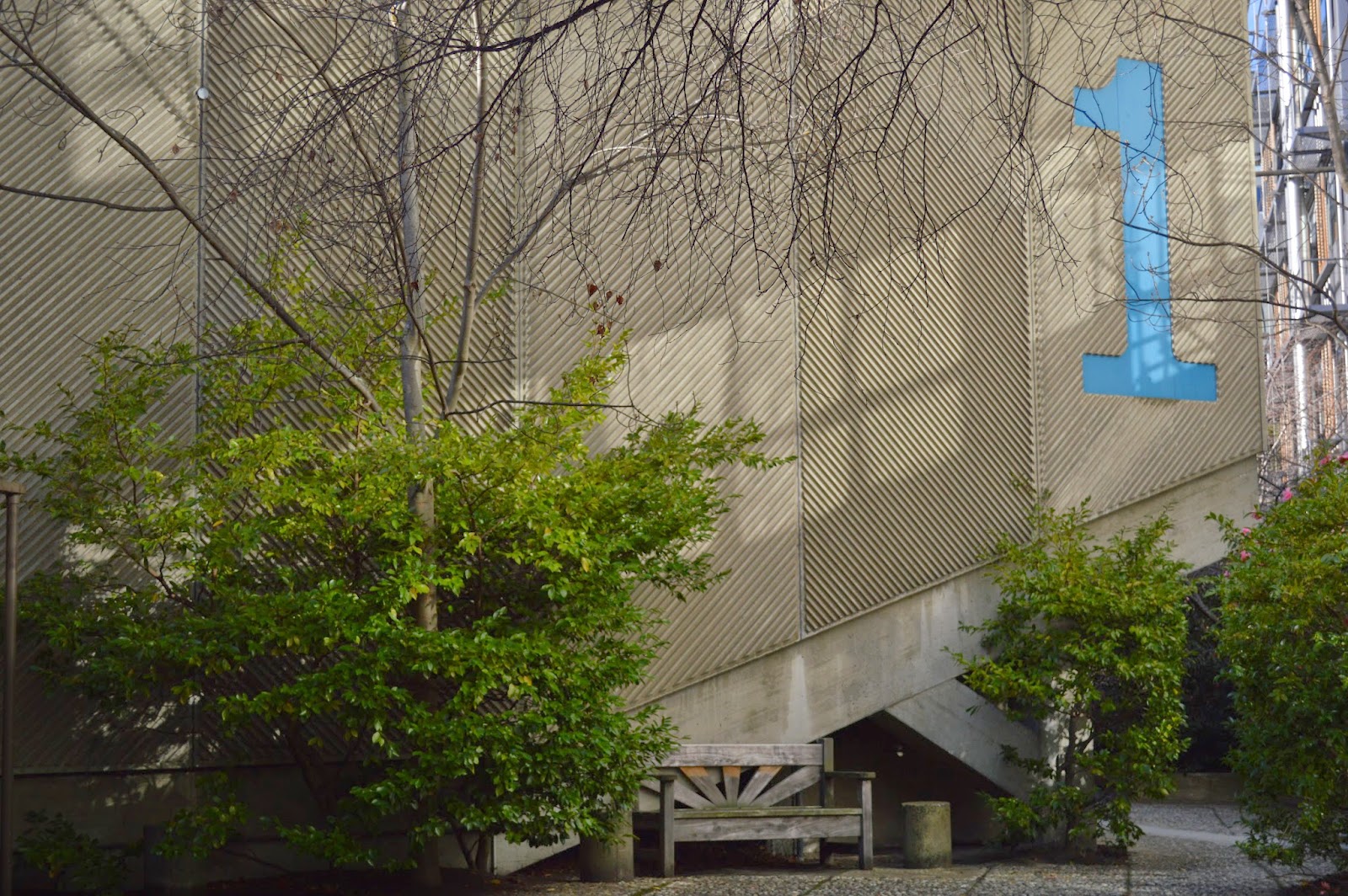
The 'x' shape layout building is partly submerged in shrubbery at the Otago University Campus. Concealing parts of the colourful morals that box out of the building. The wings of the 'x' shape rise up off the ground supported by heavy angular concrete beams.I love the exterior which  is made of rough poured concrete playing with texture the exterior has horizontal lines created with the concrete and giant graphic numbers are placed on the side of the buildings.

The interior has a mixed media of material that I don't like. The ceiling is stained timber placed in a diagonal design. the outer walls are an olive colour which are rough casted, in my opinion I don't like that texture inside a building. the floor is titled in a burnt red colour and I enjoy looking at the internal walls that are painted white with a three toned graphic illustration that curves and sweeps around the walls. All of the graphics were crafted and designed by Ted McCoy the architect who designed the building. Ted McCoy added the graphics because he wanted to add colour and playfulness to the building,On all four entrances to the building they all open up to a courtyard.


Monday, 28 July 2014

Law Courts Hotel


The Law Courts Hotel was built in 1863 by architect Henry McDowell Smith as the Auld Scotland Hotel, changing its name in 1902 after the Law Courts were built nearby in 1899. The majority of the original building was demolished in 1937 and re-built in what was considered an especially modern style for the time, then modernised again in the early 1950's when the Queen and the Duke of Edinburgh stayed there during their visit to Dunedin in 1954. 


Viewed from the outside, the Law Courts Hotel is definitely designed along the principles of modernism with its rounded corners, symmetrical layout, flat roof and horizontal banding. The arrangement and alignment of its windows could be considered a toned-down version of the strip style shown on similar modernist architecture from the time such as the Millers Building in Christchurch.
It also has several features which are in contrast to the modern look such as the decorated friezes and embossed panels. Together, this combination of designs give the impression of a building that is bridging the two architectural styles without fully committing to either.