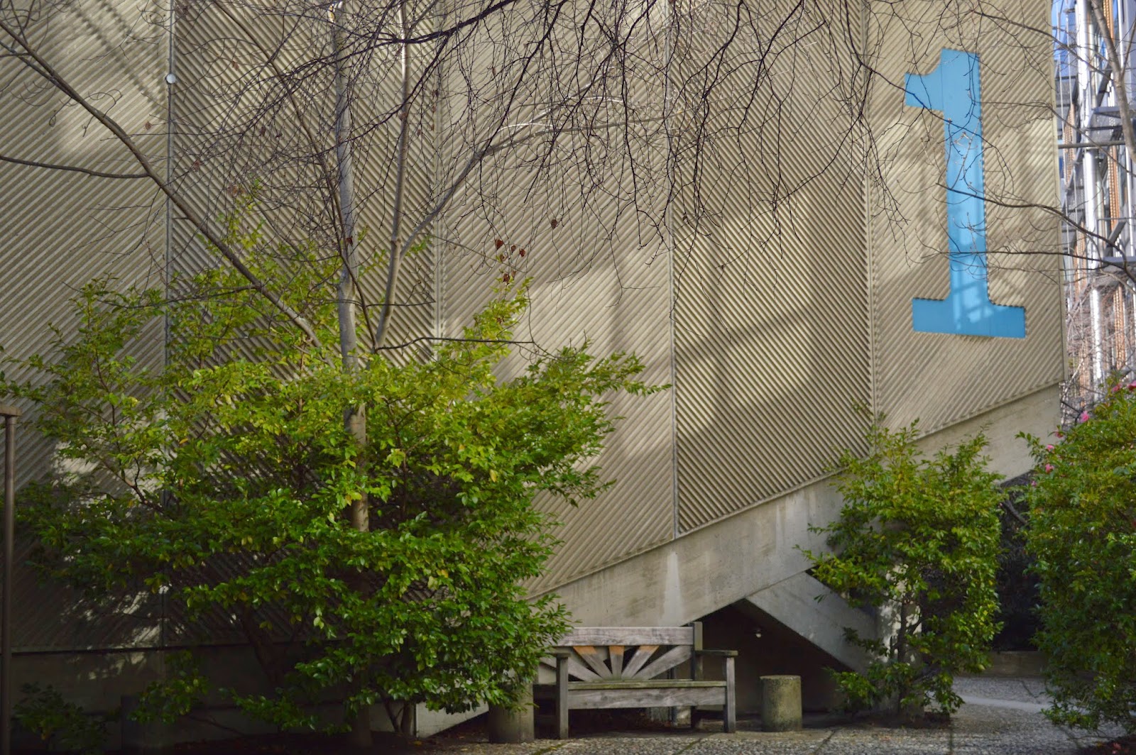
The 'x' shape layout building is partly submerged in shrubbery at the Otago University Campus. Concealing parts of the colourful morals that box out of the building. The wings of the 'x' shape rise up off the ground supported by heavy angular concrete beams.I love the exterior which is made of rough poured concrete playing with texture the exterior has horizontal lines created with the concrete and giant graphic numbers are placed on the side of the buildings.
The interior has a mixed media of material that I don't like. The ceiling is stained timber placed in a diagonal design. the outer walls are an olive colour which are rough casted, in my opinion I don't like that texture inside a building. the floor is titled in a burnt red colour and I enjoy looking at the internal walls that are painted white with a three toned graphic illustration that curves and sweeps around the walls. All of the graphics were crafted and designed by Ted McCoy the architect who designed the building. Ted McCoy added the graphics because he wanted to add colour and playfulness to the building,On all four entrances to the building they all open up to a courtyard.


No comments:
Post a Comment